Blue walls have surged in popularity: recent industry analysis shows roughly 62% of homeowners now prefer blue hues for at least one room in their homes, driven by blue’s calming psychology, versatility, and strong visual impact. This article explains why that statistic matters, how blue works in different light and architectural contexts, and practical steps homeowners can take to choose the right blue for living rooms, bedrooms, kitchens, and accent walls. Along the way you’ll find trend-driven color recommendations, eco-friendly options, and a simple checklist to test samples at home so you avoid costly color regrets. For Seacoast New Hampshire and Massachusetts homeowners, local factors like coastal light and traditional New England architecture influence shade choice; Handymasters Painting Co., a locally owned father-and-son team serving the Seacoast area, offers free estimates and color consultations to help translate these ideas into a finished room. Read on for room-by-room guidance, a concise rundown of 2025 blue trends, resale considerations, and service-minded tips for hiring professionals to execute your blue paint project confidently.
Blue walls are popular because blue combines psychological calm, perceived reliability, and design flexibility, making it suitable for many styles and spaces. Color psychology research indicates blue reduces stress responses and promotes feelings of trust and relaxation, which is why many homeowners choose blue for bedrooms, living areas, and shared spaces. Blue’s versatility comes from its range—navy can add sophistication while muted coastal blues create airy calm—and its undertones (gray, green, or violet) help it coordinate with wood, metal, and stone finishes. Understanding these mechanisms clarifies why 62% of homeowners favor blue: it reliably supports mood, pairs well with common materials, and adapts to varying light conditions. The next section breaks down homeowner motivations behind that statistic and practical design outcomes.
The Impact and Emotional Resonance of Blue Hues on Affective States
Color is a significant visual language that influences human emotions, behaviors, and psychological states. Among various colors, blue is distinguished by its profound impact on mood, serving as both a calming presence and a source of melancholy. This paper investigates the psychological, cultural, and artistic dimensions of blue, analyzing its emotional effects across diverse contexts. Through studies in color psychology, artistic applications, and cultural symbolism, blue is demonstrated to evoke tranquility and introspection, shaping its role in art, design, and emotional well-being. The findings underscore the complex interplay between blue’s visual properties and its emotional resonance, offering insights into its application in psychological and creative practices.
The Impact and Emotional Resonance of Colors on Mood: a Focus on Blue, 2025
The 62% preference reflects homeowners valuing mood, adaptability, and timelessness when choosing paint colors for interiors. Homeowners report picking blue because it promotes calm in private rooms, conveys a polished look in common areas, and functions as a neutral when paired with warm woods and brass accents. Blue’s adaptability is partly mechanical: cool blues recede visually, making rooms feel larger, while deep blues anchor spaces and create a focal point for furniture and art. These practical outcomes—improved perceived scale, a calming environment, and flexible styling—explain the statistic and guide room-specific choices that follow.
Blue walls offer three primary benefits that translate into everyday home life: mood regulation, visual expansion, and stylistic longevity. Psychologically, blue reduces anxiety and supports restful sleep when used in bedrooms; visually, lighter blues can make compact Seacoast rooms feel more open and airy; stylistically, many blue tones remain fashionable across design cycles, reducing repainting frequency. Additionally, blue pairs naturally with common finishes—weathered wood, navy hardware, and white trim—so homeowners can refresh decor without a full remodel. These advantages make blue a pragmatic choice for homeowners seeking both aesthetic and functional returns.
These benefits set the stage for 2025’s most popular blue shades and how to apply them in your home.
Top blue trends for 2025 emphasize depth, muted coastal influences, and sophisticated blue-grays that work with sustainable materials and layered textures. Designers are favoring deep jewel blues and navy for focal walls, muted blue-grays for open-plan living spaces, and soft coastal blues for bedrooms and seaside homes. These directions reflect broader shifts toward comfort-driven palettes and materials with tactile warmth, where blue anchors both contemporary and traditional interiors. Below is a compact comparison of trending blues, their undertones, best rooms, and brand-style examples to help you scan options quickly.
Popular blue shades for 2025 include:
This table clarifies how undertone and context shape a shade’s effect and points to practical pairings for 2025 installations.
2025’s trending shades skew toward versatility: blue-grays that read neutral in varying light, saturated jewel tones for focal points, and muted coastal blues for relaxed interiors. Blue-grays work well in Seacoast homes where morning and evening light shifts; jewel tones add drama in smaller doses like built-ins or cabinetry; muted coastal blues complement traditional New England detail without feeling overly nautical. For practical selection, sample at least three shades on the intended wall, view at different times of day, and assess with the existing flooring and trim. These steps minimize surprises and help you choose a 2025-appropriate blue that performs in your home’s specific light.
Several established brands consistently produce reliable blue collections and offer tools for sampling and visualization, which helps homeowners test options before committing to a full job. Brand differences often come down to pigment depth, undertone accuracy, and available finish sheens; some brands provide extended color cards with curated palettes that simplify pairing with whites and neutrals. Regardless of brand, professionals recommend buying sample sizes and testing painted swatches in situ, as small printed swatches rarely capture real-world undertone interactions. Using professional-grade tools and finishing options ensures better coverage, color fidelity, and long-term durability when applying trending blues.
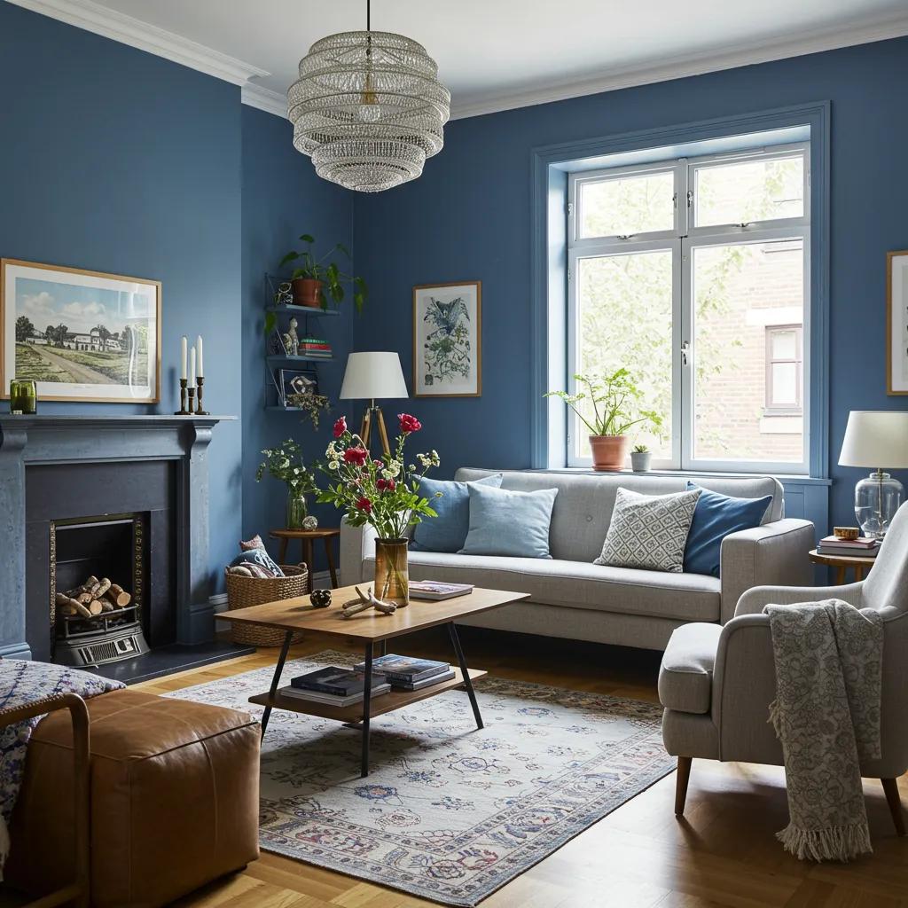
Blue paint transforms rooms by changing mood, perceived scale, and architectural emphasis, and the right shade depends on light, purpose, and adjacent finishes. In living rooms, deeper blues create cozy sophistication that anchors seating areas, while lighter blues open compact spaces and highlight natural light. Bedrooms benefit from desaturated blues that promote sleep and relaxation, and kitchens or cabinets gain personality and depth when paired with durable finishes and contrasting hardware. Below are targeted recommendations per room followed by practical styling tips and a brief local case-style note about applying these ideas in Seacoast homes.
For living rooms, choose between anchoring deep blues and airy blue-grays depending on scale and light: deep navy or jewel blue defines large seating arrangements and formal rooms, while blue-gray or muted coastal blue brightens smaller areas. Select an eggshell or satin finish for walls to balance durability and subtle sheen, and pair blue walls with warm wood tones, natural textiles, and mixed metals for layered contrast. Use area rugs, throw pillows, and artwork to introduce accent colors that lift the palette, and test swatches near large windows to confirm undertone behavior in both sunlight and evening light. Thoughtful pairing ensures blue contributes style without overpowering furnishings.
Bedrooms call for desaturated, soft blues with gray or green undertones that encourage rest and minimize stimulation before sleep. Pale blue-grays, muted coastal blues, and light sky blues create a serene backdrop for bedding and natural materials, and low-sheen finishes like eggshell reduce light reflection to promote restful atmospheres. Consider accenting with deeper blues on a headboard wall or built-in shelving to add depth without reducing brightness, and always test samples under evening lamp light to ensure the shade remains calming after sunset. These choices help bedrooms feel intentionally tranquil and suitable for sleeping and unwinding.
Psychological Impact of Color on Mood and Decision-Making
This study investigates the psychological effects of colors on individuals within the student union complex of a university campus, selected for its diverse color palette. Employing a survey methodology, questionnaires were developed and administered to a representative sample of students, encompassing both international and local, undergraduate and graduate levels. Collected and analyzed questionnaires revealed the influence of different colors on student moods across various areas of the student union complex. This research contributes to a deeper understanding of how colors affect human emotions, thereby informing better decision-making and optimizing space utilization through color selection aligned with intended purposes.
A colorful impact: the psychological impact of colors, 2020
Blue cabinets and kitchen walls require durable finishes and careful pairing with counters and hardware to ensure longevity and cohesive style. Semi-gloss or satin finishes on cabinetry provide wipeable surfaces ideal for kitchens, and deep navy or jewel blues can add striking contrast against lighter countertops and stainless or brass hardware. Prep is critical: proper priming and smooth sanding ensure even coverage and prevent streaking, while sample testing near natural and artificial light confirms undertone interactions with stone or quartz counters. Selecting the right finish and execution approach ensures blue kitchens remain both beautiful and functional.
Navy accent walls create a dramatic focal point when applied thoughtfully to the right architectural elements—think built-ins, paneling, trim, or a single wall behind a bed or fireplace. Pair navy with crisp white trim and warm wood furnishings for classic New England elegance, or combine navy with textured wallpapers and brass hardware for an updated eclectic look. Consider partial treatments—navy wainscoting or framed paneling—for depth without overwhelming a room, and use art lighting or sconces to bring out navy’s richness. These strategies let navy provide weight and sophistication while remaining adaptable to different interior styles.
As a local example of execution in the Seacoast area, Handymasters Painting Co., a trusted father-and-son team serving Portsmouth and the surrounding Seacoast, provides free estimates and color consultations to help homeowners translate these navy and coastal blue concepts into finished rooms. Their six-step process, including eco-friendly paint options, and satisfaction guarantee streamline selection and ensure professional application, helping local homeowners achieve the intended mood and durability.
Blue paint can positively influence resale value when used thoughtfully—buyers often respond well to tasteful, neutral-to-inviting blues that read as updated yet timeless. Market research indicates that certain well-chosen colors can improve buyer appeal and perceived care of a home, though exact price uplifts depend on region, property condition, and the room painted. Blue tones that read as neutral (soft blue-grays) tend to be more broadly appealing in listings and showings, while very bold blues may appeal to niche buyers and occasionally require neutralization. Homeowners preparing to sell should favor universally appealing blues in key rooms to maximize buyer interest without over-personalizing the palette.
Quantifying resale uplift from paint alone is complex because pricing reflects many variables, but staging and color choices can influence time-on-market and buyer perception. Studies and market analyses suggest that fresh, neutral paint in popular tones can reduce perceived work for buyers and sometimes lead to faster offers; however, the dollar uplift varies widely by market and property condition. For local sellers in Seacoast areas, choosing a broadly appealing blue-gray for main living areas and neutral whites for trim often yields the best balance between style and marketability. When in doubt, favor colors that photograph well under listing conditions and complement architectural details.
Buyers prefer homes with tasteful blue walls because blue conveys cleanliness, calm, and modern sophistication without feeling trendy in the short term. Psychologically, blue signals stability and care, which positively affects buyer impressions during showings and open houses. Rooms painted in soft, well-executed blues photograph favorably in listing images and help buyers imagine living in the space, increasing emotional connection. These buyer preferences explain why strategic blue choices—especially in living rooms and bedrooms—can support better staging outcomes and a smoother sales process.
These impacts show how color choice intersects with resale strategy and staging.
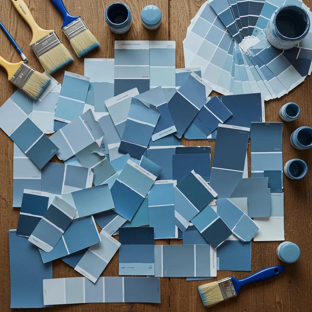
Choosing the perfect blue requires a checklist-driven approach that evaluates light, undertone, finish, room function, and existing materials; testing samples in situ is essential to avoid costly mistakes. Start by observing the room at multiple times of day, identify warm or cool light sources, and consider how adjacent floors and furniture will interact with undertones. Select finishes based on durability needs—satin or eggshell for most walls, semi-gloss for trim and cabinets—and always paint multiple large swatches to see color behavior in real life. The checklist below distills the decision process into actionable steps you can follow before committing to a full paint order.
Following a methodical process reduces the risk of choosing a shade that looks different in your space than on a sample card.
Key factors include lighting direction and intensity, undertone interactions with existing materials, finish durability, and the psychological effect appropriate for the room’s function. South- or west-facing rooms with strong sunlight may warm up cool-blue tones, while north-facing rooms can make blues read duller and more muted; adjusting saturation and undertone can correct for this. Consider the finish carefully: eggshell or satin balances sheen and washability for living rooms and bedrooms, while semi-gloss suits cabinets and trim. Finally, test multiple large swatches against your furnishings and flooring to observe undertone shifts across the day.
Handymasters Painting Co. offers local, hands-on support to translate these selection steps into a finished project tailored to Seacoast homes, including free estimates and color consultations that focus on lighting, undertone selection, and finish recommendations. As a locally owned father-and-son team serving the Seacoast area, they bring a service-oriented approach that emphasizes a six-step proven process to ensure consistent results and homeowner satisfaction. Their service options include eco-friendly paint choices for clients prioritizing low-VOC products, and the company provides a satisfaction guarantee to reduce homeowner risk. Booking a consultation gets you a practical sample plan and a transparent estimate to move from color selection to professional execution.
Eco-friendly blue paints prioritize low-VOC formulas and safer indoor air quality while offering competitive pigment and finish quality suitable for modern interiors. Choosing low-VOC or zero-VOC alternatives reduces odors during application and lowers off-gassing over time, which is important in bedrooms, nurseries, and homes with sensitive occupants. Several reputable manufacturers now offer eco-focused lines that include popular blue tones, enabling homeowners to match style goals with health and environmental priorities. The table below compares eco-focused paint products and their features to help you choose options that align with performance and indoor-air-quality needs.
This table highlights trade-offs between pigment depth and VOC levels so you can choose an eco option that still delivers the blue you want.
Choosing eco-friendly paints improves indoor air quality, reduces strong odors during application, and minimizes long-term off-gassing—benefits that matter for homes with children, pets, or respiratory sensitivities. Low- and zero-VOC formulations have advanced significantly, offering robust pigment and finish options that perform comparably to traditional paints when applied correctly. Selecting eco-friendly options also pairs well with sustainable design goals, supporting overall healthier interior environments without sacrificing color fidelity. For homeowners, these benefits translate into a safer drying period and a friendlier living environment post-paint.
Several mainstream paint lines now include low-VOC or zero-VOC collections that cover popular blue tones and provide reliable finish options; homeowners should compare product specifications and sample the exact shade in large swatches. When evaluating brands, check VOC ratings, recommended finishes for the room type, and how deep blues render with lower pigment loads in eco formulations. Professional applicators familiar with eco-friendly products can advise on primer choices and application techniques to ensure full coverage and color depth. Testing samples in your space remains the best way to confirm that a chosen eco-friendly blue meets both aesthetic and performance expectations.
For homeowners ready to move from selection to execution, Handymasters Painting Co. provides free estimates and consultative guidance on eco-friendly paint options and a six-step process to ensure durable results and satisfaction for Seacoast projects.
Blue paint is known for its calming effects, which can significantly influence the mood of a space. Research in color psychology indicates that blue hues can reduce stress and anxiety, promoting feelings of tranquility and relaxation. This makes blue an ideal choice for bedrooms and living areas where comfort is essential. Additionally, blue is often associated with trust and reliability, which can enhance the overall ambiance of a home, making it feel more inviting and secure for both residents and guests.
Lighting plays a crucial role in how blue paint colors are perceived. Natural light can enhance the vibrancy of blue hues, while artificial lighting may alter their appearance. For instance, south-facing rooms receive warm light that can make cool blues appear more vibrant, whereas north-facing rooms may cast a cooler, muted tone. Homeowners should test paint samples at different times of day to see how the color interacts with both natural and artificial light, ensuring the chosen shade complements the room’s ambiance throughout the day.
Eco-friendly blue paints are increasingly popular, focusing on low-VOC or zero-VOC formulations that improve indoor air quality. Brands like Benjamin Moore and Sherwin-Williams offer eco-friendly lines that include a variety of blue shades. These paints minimize harmful emissions during application and over time, making them suitable for homes with children or pets. When selecting eco-friendly options, homeowners should consider the balance between pigment depth and VOC levels to ensure they achieve the desired aesthetic without compromising health and safety.
Yes, blue paint can positively impact a home’s resale value when applied thoughtfully. Buyers often respond favorably to well-chosen blue hues that convey a sense of calm and modernity. Soft, neutral blues tend to appeal to a broader audience, making homes feel more inviting. However, the effect on resale value can vary based on regional preferences and the overall condition of the property. Homeowners should aim for universally appealing shades in key areas to maximize buyer interest and enhance marketability.
For small spaces, lighter blue shades such as soft sky blue or muted coastal blue are ideal as they create an illusion of openness and airiness. These colors reflect light, making compact areas feel larger and more inviting. Additionally, using blue-gray tones can provide a neutral backdrop that complements various decor styles without overwhelming the space. Homeowners should consider using these lighter shades on walls and pairing them with darker accents to add depth without sacrificing the sense of space.
To test blue paint colors effectively, homeowners should apply large swatches of paint on the intended wall and observe them at different times of day. This allows for a better understanding of how the color interacts with natural and artificial light. It’s also beneficial to compare the swatches against existing furnishings and flooring to see how undertones work together. Living with the samples for a few days can help homeowners make a more informed decision, ensuring the chosen shade aligns with their vision for the space.
Common mistakes when choosing blue paint include selecting a shade based solely on a small sample or swatch, neglecting to consider lighting conditions, and failing to test the color in the actual space. Homeowners often overlook how different undertones can affect the overall look, leading to unexpected results. Additionally, not considering the room’s function can result in a color that feels out of place. To avoid these pitfalls, it’s essential to test multiple shades in situ and consider the room’s purpose and lighting before making a final decision.
Choosing blue paint for your home not only enhances aesthetic appeal but also promotes a calming atmosphere, making it a favored choice among homeowners. The versatility of blue allows it to adapt to various styles and settings, ensuring it remains timeless and relevant. By selecting the right shade and finish, you can create spaces that feel both inviting and spacious. Discover our expert color consultation services to help you find the perfect blue for your home today.