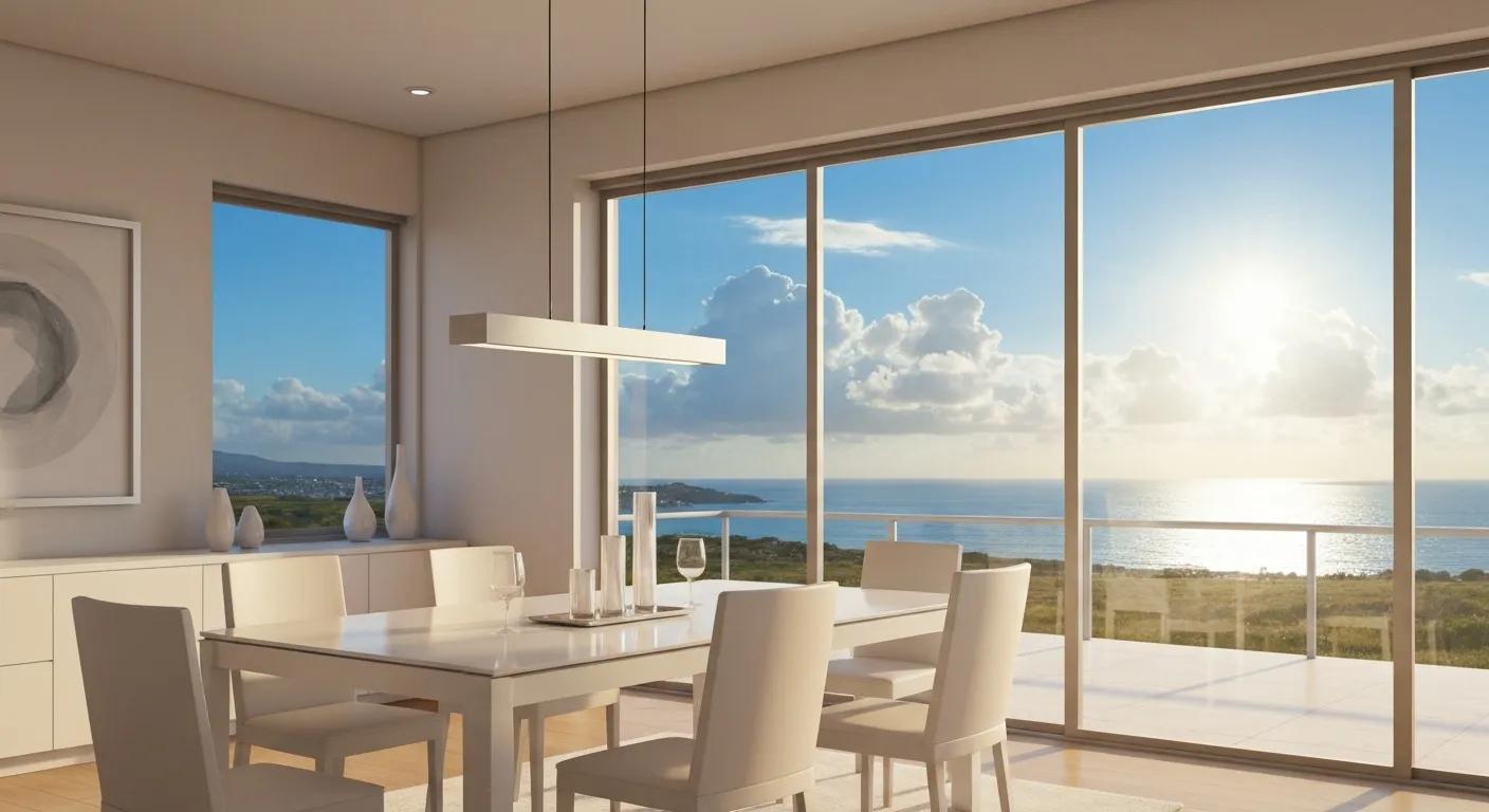
Portsmouth’s coastal charm is a layered language of weathered wood, sea-glass patinas, tidal blues, and historic brick that can be translated into dining-room palettes that feel both rooted and refreshed. This guide shows how local dockside textures and Portsmouth’s colonial and Victorian architecture inform practical paint choices, finishes, and styling for dining rooms while mapping a clear path from inspiration to selection and, if desired, professional color consultation. Many homeowners struggle to balance authentic seacoast character with modern livability; the right palette resolves that tension by matching light, scale, and finish to room use. Below we define the core color families tied to Portsmouth places, walk through a step-by-step method for choosing dining-room colors, offer adaptable palettes for other rooms and exteriors, and explain when a local color consultation and professional interior painting make the process faster and more durable. Throughout, targeted phrases such as coastal color palettes Portsmouth, Portsmouth dining room paint colors, and docks-inspired palettes are woven into actionable recommendations to help Seacoast homeowners make confident color decisions.
Portsmouth’s coastal charm centers on five core color families that derive directly from the harbor, docks, and historic architecture: weathered wood grays, tidal/navy blues, sea-glass greens, sandy neutrals, and brick reds. These families work together as a palette system where a durable neutral anchors the room, a maritime mid-tone provides depth, and one or two accents recall local materials. Using these families yields interiors that read as authentic to the Seacoast while remaining adaptable to varying dining-room sizes and light levels. Below is a quick list mapping each family to a local visual cue and an interior use, optimized for rapid reference and inspiration.
The essential Portsmouth palette and quick uses:
These families create combinations that nod to place while serving the functional needs of dining rooms, and understanding them leads naturally to more specific, room-level selection methods.
Dockside hues are specific cues taken from boat paint, algae, sun-bleached planks, and tidal pools that translate directly to interior paint choices. Sea-glass green suggests a muted, slightly grayed green for cabinetry or wainscoting; oyster-shell beige captures barnacle-stained ropes and makes a warm, reflective base; algae and kelp tones become deeper accent greens when paired with soft neutrals. Coastal materials often carry a salt-weathered matte quality, so consider pairing these hues with low-sheen finishes to maintain authenticity and reduce glare. By selecting one dockside hue as a dominant tone and a contrasting maritime accent, you capture the harbor’s palette while keeping the dining space coherent and comfortable.
Historic Portsmouth architecture—brick facades, clapboard siding, and painted trims—offers an immediate palette of robust pigments and soft creams that inform interior contrast and trim decisions. Brick-red accents work as lively focal points tied to fireplace surrounds or built-in shelves, while clapboard creams and warm off-whites create period-appropriate backgrounds that modernize easily with contemporary furnishings. Trim whites drawn from historic moldings can provide crisp definition between wall fields and ceilings, preserving architectural detail in older homes. Balancing these historic cues with modern finishes—matte or eggshell walls with satin trim—lets the dining room feel both authentic to Portsmouth’s past and updated for present-day living.
Choosing the right coastal colors for a Portsmouth dining room follows a concise, repeatable process: gather local inspiration, test samples in situ, evaluate lighting and finish, then finalize a palette with scale and furniture in mind. This framework reduces uncertainty by anchoring choices to concrete variables—light direction, room size, and existing architectural materials—so decisions are grounded rather than hypothetical. The practical steps below give homeowners an actionable path from feeling to finish, and a short EAV comparison helps match finish to mood and light conditions.
Follow these steps to choose a dining-room palette:
Intro to finish/lighting EAV table: The table below compares color families with recommended finishes and the typical mood or use case in Portsmouth dining rooms, helping homeowners match aesthetic intent to technical choice.
This comparison clarifies how finish choices influence perception and durability, letting homeowners pick paint and sheen that match both mood and maintenance needs.
Practical, scenario-driven mini-palettes help homeowners visualize specific applications: a small waterfront condo needs brighter neutrals and a single saturated accent, while a Victorian dining room can embrace deeper historic reds and layered woods. Here are three curated mini-palettes tailored to common Portsmouth dining-room scenarios, each listing primary, accent and trim suggestions and a brief mood descriptor.
These mini-palettes show when to choose lighter bases for small rooms and deeper tones for rooms with generous natural light, providing clear guidance for implementation and sample testing.
Lighting and decor dramatically alter how coastal colors read: natural north light softens blues and greens, while warm west light intensifies reds and warm neutrals. Choose bulb temperature and fixture placement to support the intended mood—warm-tone LEDs for intimate dinner lighting, cooler bulbs where clarity and contrast are desired. Decor choices such as linen tablecloths, jute rugs, and medium-warm wood chairs complement sandy neutrals and sea-glass tones, while brass or aged-iron accents bring contrast to navy and brick-red hues. Staging swatches near real textiles and fixtures during the testing phase ensures the final palette harmonizes across materials and light conditions.
A cohesive home translates dining-room choices into living rooms, bedrooms, and exteriors by shifting scale, saturation and materials while retaining core family ties. For living spaces, soften maritime mid-tones into paler variants and layer textiles; bedrooms benefit from muted sea-glass greens or sandy neutrals for restful warmth. Exteriors should reference local materials—weathered wood siding, brick foundations and maritime trims—while choosing durable finishes that handle salt air. The quick EAV table below summarizes room-specific primary and accent colors alongside practical material pairings to maintain visual flow throughout a Portsmouth home.
Room-specific comparison table intro: This table helps homeowners adapt core palette choices to living rooms, bedrooms, and exteriors with concise pairing and maintenance tips.
The table shows how modest adjustments—muting a color, changing finish, or shifting scale—create continuity while meeting functional needs like wear and weather resistance.
Living rooms and bedrooms need palettes that balance relaxation with identity; softer interpretations of harbor tones often perform best in these spaces. For living rooms, sandy neutrals as primary walls with tidal/navy or weathered-gray accents enable layering of textiles and art, while bedrooms favor muted sea-glass or dove-gray primaries with warm wood and soft linens to enhance calm. Textiles such as linen curtains, wool throws, and jute rugs reinforce coastal tactility and pair naturally with painted surfaces. Choosing complementary finishes—matte or eggshell for walls and satin for built-ins—creates a cohesive tactile experience that ties rooms to Portsmouth’s maritime and historic identity.
Exterior palettes should reflect local materials and anticipate coastal weathering; classic combinations include weathered gray siding with crisp trim, brick-red accents that reference historic facades, or deep navy siding with lighter sand-colored trim for strong contrast. Select high-quality exterior paints formulated for salt-spray environments and favor finishes that shed water while resisting chalking. Trim details can be highlighted with semi-gloss for durability and easier cleaning, while larger wall fields use satin or low-sheen formulations to hide minor surface imperfections. Thoughtful exterior palettes anchor a home in its Portsmouth context and create curb appeal that ages gracefully.
Professional interior painting and color consultation deliver accurate color translation, proper surface preparation, and finish choices tailored to coastal conditions—advantages that matter when matching historic palettes or protecting high-traffic dining areas. Professionals bring local knowledge of Portsmouth light, materials, and aging patterns so color choices read as intended across seasons and scales. Benefits include thorough surface prep to handle older wood and plaster, expert sheen recommendations for durability, and precise application techniques that preserve architectural details. If you want a faster, more predictable outcome or a bespoke palette grounded in Portsmouth’s character, a local color consultation and painting service can streamline selection and ensure long-term results.
Professional service process and soft call-to-action paragraph: A typical local color consultation involves an on-site assessment, curated sample proposals, and trial swatches applied to the actual walls; follow-up refinements ensure the final decision complements both light and furnishings. For Seacoast homeowners who prefer expert guidance, engaging a color consultation followed by professional interior painting translates docks-inspired palettes into durable, high-quality finishes that wear well in coastal conditions.
A color consultation typically begins with a site visit to assess light, architecture and existing finishes, followed by curated palette proposals and in-room sample application to confirm perception across daylight and evening light. Deliverables often include annotated swatches, a recommended finish schedule, and implementation guidance for trim and accent work. This process reduces guesswork, shortens decision timelines, and helps homeowners avoid costly repaint cycles due to misjudged light or finish. Local consultants also recommend maintenance-appropriate sheens and paint types suited to Seacoast exposure.
Local painters combine craftsmanship, correct surface preparation, and material knowledge—such as choosing rot-resistant primers or rust-inhibiting treatments for coastal homes—to ensure long-lasting results that respect Portsmouth’s aesthetic. Techniques like careful feathering at trim, historically sympathetic color matches, and subtle glazing or distressing can reinforce a maritime or historic feel without appearing contrived. Local experience helps specify finishes that balance appearance and durability, keeping painted surfaces looking intentional as they weather. Working with painters who understand regional materials ensures the finished palette preserves both the look and longevity homeowners expect.
Coastal colors bring a sense of tranquility and freshness to home design, evoking the natural beauty of seaside environments. These hues, such as soft blues, greens, and sandy neutrals, create a calming atmosphere that can enhance relaxation and comfort. Additionally, coastal colors can make spaces feel larger and more open, especially in smaller rooms. They also provide versatility, allowing homeowners to mix and match with various decor styles while maintaining a cohesive aesthetic that reflects the charm of coastal living.
Incorporating coastal themes into your dining room can be achieved through various elements such as color palettes, materials, and decor items. Start by selecting a coastal color scheme, like sea-glass greens or sandy neutrals, for your walls and furnishings. Use natural materials like wood, jute, or linen for table settings and upholstery. Adding decor items like nautical-themed artwork, driftwood centerpieces, or seashell accents can further enhance the coastal vibe. Finally, consider using lighting that mimics natural sunlight to create a warm and inviting atmosphere.
Lighting significantly impacts how coastal colors are perceived in a space. Natural light can enhance the vibrancy of blues and greens, making them appear more refreshing, while warm artificial lighting can soften these colors, creating a cozy ambiance. It’s essential to consider the direction and quality of light in your dining room when selecting paint colors and finishes. Using layered lighting, such as ambient, task, and accent lights, can help highlight the coastal palette and create a dynamic visual experience throughout the day and evening.
Yes, specific finishes can enhance the coastal theme in interiors. For walls, eggshell or satin finishes are often recommended as they provide a soft sheen that reflects light without being overly glossy. These finishes are also easier to clean, making them practical for dining areas. For trim and accents, a semi-gloss finish can add a touch of elegance and highlight architectural details. Choosing low-sheen finishes for larger wall areas can help hide imperfections while maintaining a relaxed, coastal feel throughout the space.
To ensure your coastal color choices remain timeless, focus on selecting a balanced palette that incorporates both classic and contemporary elements. Stick to neutral bases, such as sandy beiges or soft whites, which can easily adapt to changing trends. Use coastal accent colors sparingly to maintain a fresh look without overwhelming the space. Additionally, consider incorporating natural textures and materials that complement your color choices, as these elements can provide lasting appeal and enhance the overall coastal aesthetic of your home.
Common mistakes when choosing coastal colors include selecting overly bright or saturated hues that can overwhelm a space, or failing to consider the room’s lighting conditions. It’s also important to avoid using too many contrasting colors, which can disrupt the serene vibe typical of coastal design. Instead, aim for a harmonious palette that reflects the natural environment. Lastly, neglecting to test paint samples in the actual space can lead to misjudged color perceptions, so always sample colors before making final decisions.
Embracing Portsmouth’s coastal charm in your dining room can transform your space into a serene retreat that reflects the beauty of the seaside. By selecting the right color palette and finishes, you can create an inviting atmosphere that balances authenticity with modern livability. For those seeking expert guidance, consider a local color consultation to ensure your choices resonate with the unique character of your home. Explore our professional painting services today to bring your vision to life.