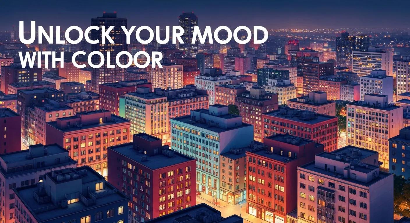
Color affects emotion because our brains interpret hue, saturation, and brightness as cues that influence arousal and attention, which in turn shape daily mood and behavior inside the home. This guide explains the core ideas of interior color psychology, practical room-by-room palettes, and simple tests you can run in your Dover home to see mood changes quickly. Many Dover homeowners notice that the same paint looks different in morning versus evening light; understanding why lets you choose colors that genuinely support sleep, productivity, or social warmth. Readers will learn color-meaning basics, how saturation and brightness change emotional impact, quick palettes for bedrooms, living rooms, and workspaces, and how a local color consultation can simplify implementation. While this article is primarily educational, Dover residents should know expert local interior painting and color consultation services are available to help translate these recommendations into sample patches and finished rooms.
Color psychology studies how visual color stimuli influence human emotion and behavior by altering physiological arousal and attention. In interiors, hue signals a basic emotion (for example, blue → calm), while saturation and brightness fine-tune intensity and warmth, producing practical outcomes like deeper sleep or increased sociability. For Dover homes with variable coastal-influenced light and mixed-period architecture, selecting a color that reads well under both soft morning light and brighter midday sun is crucial to preserve intended mood. The next two subsections break down warm vs cool associations and how saturation and brightness change those associations so you can apply the rules when sampling paint.
Color and Emotion: How Hue, Saturation, and Brightness Impact Mood
The emotion ratings showed that saturated and bright colors were associated with higher arousal. The hue also had a significant effect on arousal, which increased from blue and green to red. The ratings of valence were the highest for saturated and bright colors, and also depended on the hue. Several interaction effects of the three color dimensions were observed for both arousal and valence. For instance, the valence ratings were higher for blue than for the remaining hues, but only for highly saturated colors. Saturated and bright colors caused significantly stronger skin conductance responses. Achromatic colors resulted in a short-term deceleration in the heart rate, while chromatic colors caused an acceleration. The results confirm that color stimuli have effects on the emotional state of the observer. These effects are not only determined by the hue of a color, as is often assumed, but by all the three color dimensions as well as their interactions.
Color and emotion: effects of hue, saturation, and brightness, D Oberfeld, 2018
Warm colors such as red, orange, and yellow typically raise energy and sociability by increasing arousal and visual attention, which makes them suitable for lively social spaces. Cool colors like blue, green, and muted purple reduce arousal and promote restorative states, supporting calm, focus, and sleep—qualities often desired in bedrooms and home offices. Context alters these associations: a saturated orange accent stimulates conversation, while the same tone painted across a small, low-lit room can feel overwhelming. Understanding these dynamics helps you choose whether to use full-room color or controlled accents to match intended behavior.
Saturation (intensity) and brightness (value) determine how strongly a color triggers emotional responses; higher saturation is attention-grabbing and energizing, while lower saturation feels muted, sophisticated, and calming. Bright, high-value colors reflect more light and can make a small Dover room feel airier, whereas lower-value tones add coziness and promote relaxation in evening hours. Practical tip: test a muted hue at different times of day on a 2×2 foot patch to observe how brightness and saturation interact with your room’s light before committing. These observations lead directly to room-specific palette choices focused on desired mood outcomes.
Color Perception: Hue, Saturation, and Brightness Effects on Emotional Response
Hue, saturation, and brightness are critical dimensions of color perception, and art students may experience color-related emotions differently from non-art students due to either their specialized training or innate artistic sensitivity. Despite this intriguing possibility, limited research has systematically examined these differences. This study aims to investigate how art and non-art students perceive and emotionally evaluate different colors. Using a questionnaire-based approach, participants rated the emotional valence of colors on a 7-point semantic differential scale, ranging from very negative to very positive. The colors were carefully selected from Munsell’s color system, which enabled precise manipulation of hue, brightness, and saturation levels. The study included 36 art students and 36 non-art students, who evaluated colors under controlled experimental conditions. The findings indicate that brightness and saturation significantly influence emotional responses to colors. Warmer colors, such as orange, elicited more positive emotional evaluations, whereas cooler colors, such as blue, received less positive ratings. Importantly, while differences in emotional responses between art and non-art students were observed, these differences were relatively modest. Art students showed a slight but noticeable sensitivity to variations in brightness and hue, whereas non-art students exhibited stronger responses to color saturation.
Comparative analysis of color emotional perception in art and non-art university students: hue, saturation, and brightness effects in the Munsell color system, G Zhang, 2025
Choosing colors by room function aligns visual cues with desired behavior—sleep, socializing, focus, or appetite—so each space supports its primary purpose. For Dover homes, consider window orientation and evening humidity when choosing cooler or warmer palettes, since local light can shift perceived temperature of a hue. Below are concise room recommendations and a quick reference table to pick palettes that match mood goals.
Soft muted blues, desaturated greens, and warm neutrals help lower physiological arousal and cue the brain toward rest, making them reliable bedroom choices. Low-saturation, mid-value tones reduce contrast and visual stimulation, which supports melatonin production and easier sleep onset. For Dover bedrooms with northern exposure, choose slightly warmer undertones to avoid a too-cool nighttime cast. Test a sample panel and view it under bedside lamp light to confirm the calming effect before painting the whole room.
Living rooms benefit from a neutral base with warm accent hues that raise sociability without overwhelming the space; think warm terracotta accents, gold-toned neutrals, or coral throw-pillows against a soft gray backdrop. Using saturated colors on a single accent wall or in textiles creates focal points that activate conversation and positive arousal while preserving overall comfort. Coordinate accent choices with existing furniture and natural light to maintain a balanced, inviting atmosphere that nudges guests toward connection.
Impact of Color and Light on Mood and Visual Perception in Interior Spaces
Color and light are two ambient attributes for interior spaces that can be used in the design and modification of workspaces. The visual and psychological effects of color and light of each have been studied separately and widely. The aim of this study was to investigate the simultaneous effects of warm/cool white light on visual perception and mood in a simulated colored workspace. Thirty-three healthy male participants were recruited. They were asked to judge the visual perception and mood of three types of workspace that were designed by colors of white, red, blue, and lights of a cool and warm white in the random six sessions. The participants have experienced higher levels of tension, anger, depression, anxiety and lower levels of visual comfort, attractiveness, brightness and calmness of environment in the red condition than to white in both state of light. The blue wall reduced brightness and increased attractiveness of environment compared to white wall.
Effect of warm/cool white lights on visual perception and mood in warm/cool color environments, R Golmohammadi, 2021
A professional color consultation translates color psychology into a reliable, home-specific plan by accounting for local light, room orientation, and existing finishes—reducing costly repaints and mood mismatches. Consultants provide objective sample testing, palette coordination, and advise on sheen and finishes that preserve color intent. For Dover residents unsure how their coastal-influenced light will shift a hue, a brief consultation with a local interior painting and color consultation service can save time and ensure the finished room matches the intended mood.
A typical consultation follows clear steps: an initial walk-through to document lighting and mood goals, followed by curated palette proposals tailored to your home’s architecture and furnishings. Consultants then apply sample patches and review them at multiple times of day, refine selections based on those observations, and present a final plan that includes recommended sheen and an implementation timeline. This structured approach reduces uncertainty and creates a tested path from color idea to completed room.
Professionals use quality sampling, multiple lighting checks, and appropriate finish selection to preserve the intended mood of a color once applied. They also advise on surface preparation and application technique so pigments read consistently across walls and trim. Ask for sample patches, view them in morning and evening light, and confirm recommended sheen to maintain color fidelity. The following table clarifies how each service step creates the homeowner benefit.
Begin with small, structured experiments: sample swatches, observe at different times, and use accents before committing to a full repaint to ensure the color produces the mood you want. Three quick palettes below offer ready-to-test combinations and practical rationale for Dover homes with shifting daylight. After trying samples, consider booking a local color consultation or a sample-patch visit from Dover interior painters to finalize selections with confidence.
Color psychology suggests that different hues can evoke specific emotional responses and behaviors. For instance, warm colors like red and orange can increase energy and sociability, making them ideal for social spaces. In contrast, cool colors such as blue and green promote calmness and focus, suitable for bedrooms and home offices. Understanding these effects allows homeowners to create environments that align with their desired moods and activities, enhancing overall well-being and functionality in their living spaces.
To effectively test color effects, apply sample patches of your chosen hues on the walls of your room. Observe these patches at different times of the day to see how natural light alters their appearance. Pay attention to how each color makes you feel in various lighting conditions. This method helps you gauge the emotional impact of colors and ensures that the final choice aligns with your mood goals before committing to a full paint job.
Yes, colors that promote focus and reduce distractions are ideal for home offices. Cool tones like soft blue-gray and muted green are known to enhance concentration and create a calming atmosphere. These colors help lower stress levels and improve cognitive function, making them perfect for workspaces. Additionally, incorporating neutral shades can provide a balanced backdrop that allows for creative accents without overwhelming the senses, ultimately fostering a productive work environment.
Lighting significantly influences how colors are perceived in a home. Natural light can change the appearance of a color throughout the day, affecting its saturation and brightness. For example, a color may look vibrant in the morning light but appear muted in the evening. Understanding the type of light in each room—whether it’s warm, cool, or variable—can help homeowners select colors that maintain their intended emotional impact and aesthetic appeal throughout different times of the day.
To achieve a cohesive color scheme, start by selecting a base color that reflects your desired mood for the main areas of your home. Then, choose complementary colors for accents and individual rooms that align with their specific functions. Consider using a consistent palette of warm or cool tones to maintain harmony. Additionally, incorporating similar materials and finishes can enhance the overall flow, ensuring that each space feels connected while still serving its unique purpose.
Hiring a professional color consultant offers several advantages, including expert guidance tailored to your home’s unique lighting and architecture. Consultants can help you avoid costly mistakes by providing objective advice on color selection, sheen, and finishes that align with your mood goals. They also conduct sample testing to ensure the chosen colors work well together and in your specific environment. This professional insight can save time and enhance the overall aesthetic and emotional impact of your home.
Yes, the colors in your environment can have a lasting impact on your mood and overall well-being. Consistently living in spaces painted with colors that evoke positive emotions—such as calm blues or energizing yellows—can enhance your daily experiences and mental health. Conversely, colors that create discomfort or stress can lead to negative emotional states. By thoughtfully selecting colors that align with your desired feelings and activities, you can create a nurturing environment that supports your well-being over time.
Understanding the psychological effects of color can significantly enhance the mood and functionality of your home. By selecting the right hues for each room, you can create environments that promote relaxation, energy, or focus, tailored to your lifestyle. Consider consulting with local experts to ensure your color choices align with your vision and the unique lighting of your space. Start transforming your home today by exploring our professional color consultation services.