Portsmouth designers are actively moving beyond white paint in 2025, choosing richer, site-specific palettes that respond to light, architecture, and lifestyle to create warmer, more personal interiors. This article explains what “moving beyond white” means, why conventional neutral strategies are losing favor locally, and how techniques like color drenching, earthy greens, and jewel tones are being used to add depth and cohesion. Homeowners will learn the practical trade-offs between resale-friendly neutrals and mood-driven color, steps to test bold choices in their own rooms, and where professional color consultation provides measurable value. The following sections cover why designers are rejecting white, the top bold colors transforming Portsmouth homes, a step-by-step guide to choosing the right bold paint, and how these choices reflect broader 2025 interior design trends applied to Portsmouth light and architecture.
Designers in Portsmouth are rejecting white paint because white often flattens material richness, amplifies imperfections, and fails to respond to variable coastal light; choosing intentional color creates spatial depth, warmth, and personality. This shift responds to homeowner demand for spaces that reflect place and use, where color ties interior finishes to views and historic trim. Designers balance personalization with resale by reserving white for transitional or high-resale spaces while deploying color where it enhances mood and architectural detail.
Designers cite three practical reasons for moving past white:
These reasons point directly to the next practical topic: how specific limitations of white show up in Portsmouth homes and what color alternatives accomplish.
White and muted neutrals often reveal themselves as impractical choices in Portsmouth because coastal and overcast days change perceived undertones, making walls read colder or too bright at different times. In older homes with warm woodwork or period trim, a white field can create visual dissonance that feels unfinished rather than cohesive. White also tends to show scuffs and minor surface imperfections more readily than mid-tones, which affects durability perceptions in active family spaces.
Understanding these limitations helps homeowners decide where white still serves a purpose—such as resale-oriented rooms or minimalist modern spaces—and where a richer hue adds lasting value by harmonizing finishes and improving perceived warmth.
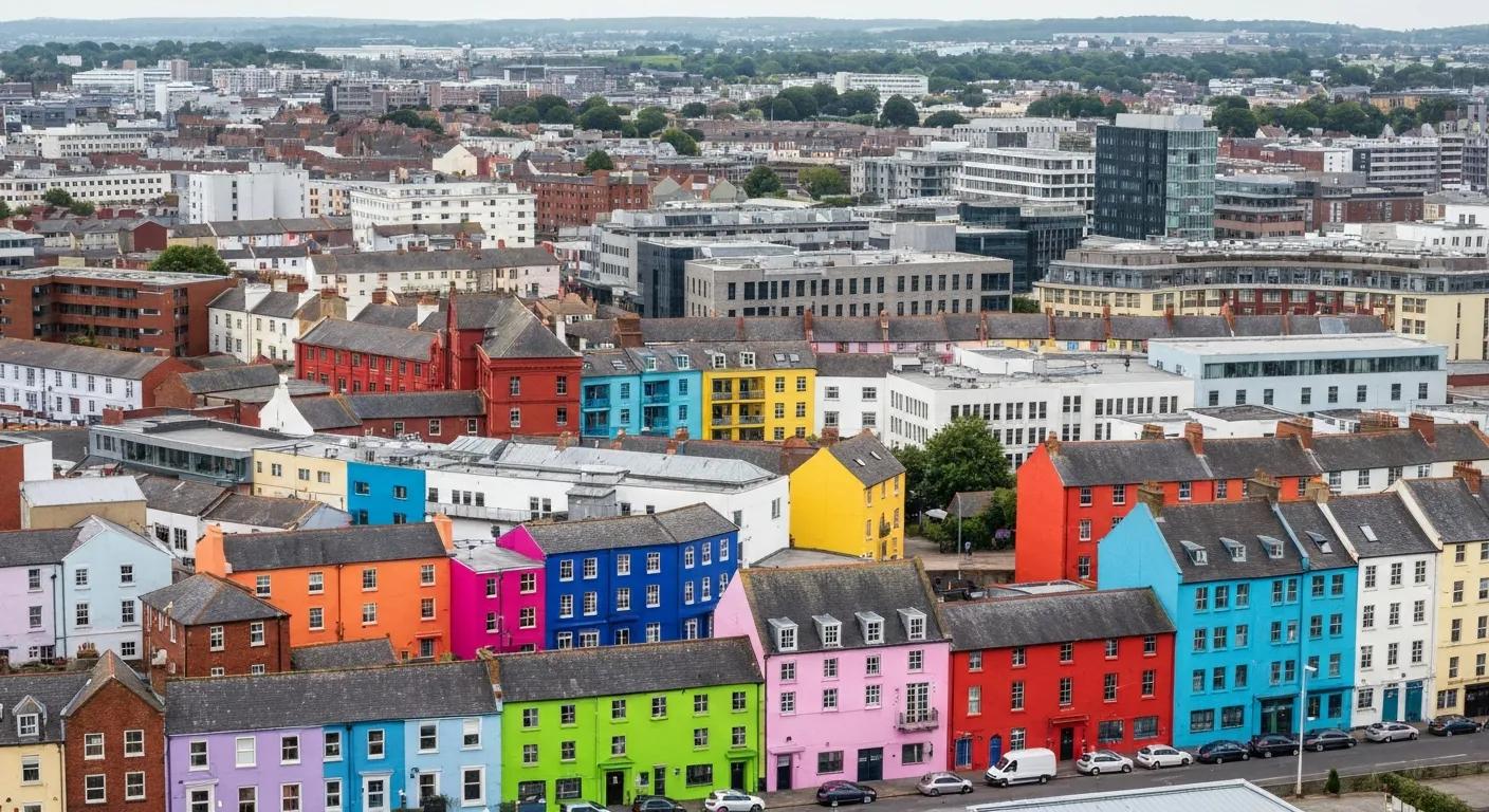
Bold color enhances Portsmouth interiors by establishing atmosphere, defining spatial hierarchy, and emphasizing architectural elements like wainscot, built-ins, or a dramatic fireplace surround. A saturated wall or color-drenched room creates a sense of enclosure and comfort, turning proportional quirks into intentional design moves that read as crafted rather than accidental. When paired with local materials—exposed beams, painted trim, or seaside textiles—bold hues reinforce the home’s story and connection to place.
These benefits lead directly into the 2025 color directions that designers are using most often in Portsmouth, including techniques like color drenching and specific earthy and jewel families.
Portsmouth’s 2025 palette favors nature-rooted and jewel-inspired hues that perform well in coastal light while offering versatile pairing options for interiors. Designers are using color drenching to unify rooms and leaning on earthy greens and deep jewel tones to create focalized, livable drama. Below is a practical list of top categories and quick use-cases for homeowners to consider.
These categories translate into application techniques such as color drenching, which is explored next along with a compact EAV reference comparing each palette’s emotional effect and light suitability.
Intro: The table below summarizes trending palettes, the emotional tone they convey, typical rooms where they excel, and suitability for Portsmouth light conditions.
This EAV-style comparison helps homeowners match mood to room and light, and it sets up practical selection steps in the next section.
Color drenching means applying a single color across walls, trim, and sometimes ceiling to create an immersive, unified interior that simplifies accessory choices and clarifies spatial intent. Designers use drenching in open-plan living areas or rooms with consistent light to avoid awkward transitions and to amplify architectural details through contrast in texture rather than hue. When selecting a drench color, designers recommend testing large swatches and choosing finishes that read consistently across natural and artificial light. This technique connects to palette selection because drenching multiplies a color’s psychological effect, making the next choices about specific shades and room uses especially important. For more specialized techniques, consider our accent wall painting services.
Psychological Factors in Painting Color Performance
Visual performance of painting colors based on psychological factors, 2022
Portsmouth designers favor earthy greens that reference salt marshes and regional flora—think moss, sage, and deeper bottle greens—paired with jewel tones like sapphire and emerald for contrast and focal points. These families are often balanced with warm neutrals on floors or upholstery to avoid overstimulation while still delivering a bold impression. Finishes are selected to complement local materials: matte or eggshell on walls, satin on trim, and deeper sheens on cabinetry for durability.
Practical pairings include mossy greens with oak and linen, sapphire with painted millwork and soft brass, and terracotta with natural stone—approaches that tighten a room’s relationship to Portsmouth’s coastal context.
Choosing a bold color requires a deliberate process: assess light, inventory fixed finishes, test large samples through the day, and consider the home’s architectural story and resale goals to find the right balance. A step-by-step checklist below helps homeowners move from inspiration to confident selection without overcommitting.
After testing and initial choices, most homeowners benefit from a concise decision table that pairs evaluation factors with practical tips.
Summary: This checklist and table empower homeowners to make measured color decisions; when questions remain or the palette must integrate complex finishes, a local professional can translate trends into a site-specific plan.
Technical and personal factors jointly determine palette success: light orientation, size and scale, permanent finishes, furniture tones, and the household’s comfort with saturation. Prioritizing factors helps resolve trade-offs—light and finishes are non-negotiable, while accent flexibility and accessories can evolve. Measuring and documenting these factors reduces second-guessing and improves results when sampling colors in situ.
These practical steps highlight why many homeowners choose professional help to accelerate confident decisions.
A local color consultant brings technical knowledge of paint undertones, finish selection, and how Portsmouth’s coastal light alters perceived color across the day; consultants also coordinate samples, create tailored palettes, and work with painters to ensure color fidelity. For expert guidance, you can always contact us for a professional color consultation. Typical consultant services include in-home light assessments, curated sample boards, mockups at scale, and guidance on finishes and trim coordination.
Engaging an experienced local consultant shortens the feedback loop between inspiration and installation and reduces costly repaints by aligning trends—like color drenching and earthy palettes—with each home’s specific conditions. Local consultation is a practical next step for homeowners who want trend-forward color without guesswork.
The move beyond white reflects 2025 trends that prioritize nature-inspired palettes, layered color stories, and immersive techniques that emphasize comfort and identity over anonymous neutrality. These trends are rooted in a broader cultural desire for interiors that support well-being and connection to place, and in Portsmouth they manifest as palettes that echo coastal landscapes and historic materials. Below is a compact mapping of major 2025 trends to local application so homeowners can see concrete translations.
This mapping clarifies how national trends translate into Portsmouth-specific outcomes, informing homeowners and guiding designers toward place-sensitive solutions.
Nature-inspired color anchors interiors to the seacoast environment and local landscape, using greens, blues, and earthen tones to create calm, restorative spaces that read as intentional extensions of outdoor views. Designers leverage material pairings—wood, rattan, stone—to reinforce the connection between paint choice and physical context, which deepens occupant comfort and prolongs the palette’s relevance across seasons.
Following this ecological logic naturally leads to an examination of how color choices affect occupant psychology and room function.
Bold colors influence perceived scale, energy, and mood: greens often calm and center, blues soothe and focus, and jewel tones amplify drama and sociability when used strategically. Designers apply these psychological effects according to room purpose—restorative tones for bedrooms, energizing accents for kitchens—so color becomes a functional tool rather than mere decoration. For homeowners, intentional color aligns spatial behavior with emotional goals and can make everyday routines feel more curated and resilient.
For homeowners interested in bringing these ideas into their own Portsmouth home, a local color consultation can translate trend language into a practical, site-specific palette and implementation plan—an invitation to explore bold color with confidence.
Psychological Factors in Painting Color Performance
Visual performance of painting colors based on psychological factors, 2022
Bold colors in home design offer numerous benefits, including the ability to create a unique atmosphere and enhance the emotional impact of a space. They can define areas within open floor plans, highlight architectural features, and evoke specific feelings based on color psychology. For instance, warm tones can energize social spaces, while cooler shades can promote relaxation in bedrooms. By thoughtfully incorporating bold colors, homeowners can transform their interiors into personalized environments that reflect their style and enhance their daily experiences.
Homeowners can effectively test bold paint colors by applying large swatches on their walls and observing them at different times of the day. This method allows them to see how natural light affects the color’s appearance throughout the day. Additionally, it’s beneficial to consider the room’s fixed finishes, such as flooring and furniture, to ensure harmony. By taking photographs of the swatches in various lighting conditions, homeowners can make more informed decisions and avoid the regret of a color that doesn’t work as intended.
When selecting paint colors, homeowners should avoid common mistakes such as choosing colors that clash with existing furnishings or failing to consider the room’s lighting. It’s also important not to rush the decision; taking time to test colors in situ can prevent costly repaints. Additionally, overlooking the emotional impact of colors can lead to a space that feels disjointed or uncomfortable. By being mindful of these pitfalls, homeowners can create cohesive and inviting interiors that truly reflect their personal style.
Local climate and light conditions significantly influence paint color choices, especially in coastal areas like Portsmouth. The quality of natural light can change how colors are perceived, with overcast days making hues appear cooler or duller. Homeowners should consider the orientation of their rooms and the amount of direct sunlight they receive. For instance, warmer colors may work better in north-facing rooms, while cooler tones can enhance brightness in south-facing spaces. Understanding these factors helps ensure that chosen colors remain vibrant and appealing throughout the year.
Color psychology plays a crucial role in home design by influencing mood, behavior, and overall well-being. Different colors evoke specific emotional responses; for example, blues are often calming, while yellows can energize a space. Designers leverage these psychological effects to create environments that align with the intended function of each room. By selecting colors that resonate with the desired atmosphere—such as restful tones for bedrooms or stimulating shades for kitchens—homeowners can enhance their living experience and promote a sense of harmony within their homes.
Homeowners can incorporate nature-inspired colors into their interiors by selecting hues that reflect the local landscape, such as earthy greens, soft blues, and warm terracotta tones. These colors can be used in various applications, from wall paint to textiles and accessories, to create a cohesive look that connects the indoors with the outdoors. Pairing these colors with natural materials like wood and stone further enhances the organic feel of the space. This approach not only beautifies the home but also fosters a sense of tranquility and connection to nature.
Embracing bold colors in Portsmouth homes not only enhances aesthetic appeal but also fosters a deeper connection to the local environment and architectural heritage. By moving beyond traditional white, homeowners can create spaces that reflect their personality and improve emotional well-being. Engaging with a local color consultant can provide tailored guidance, ensuring that each choice aligns with both style and functionality. Discover how to transform your home with our expert resources and start your journey towards a vibrant interior today.